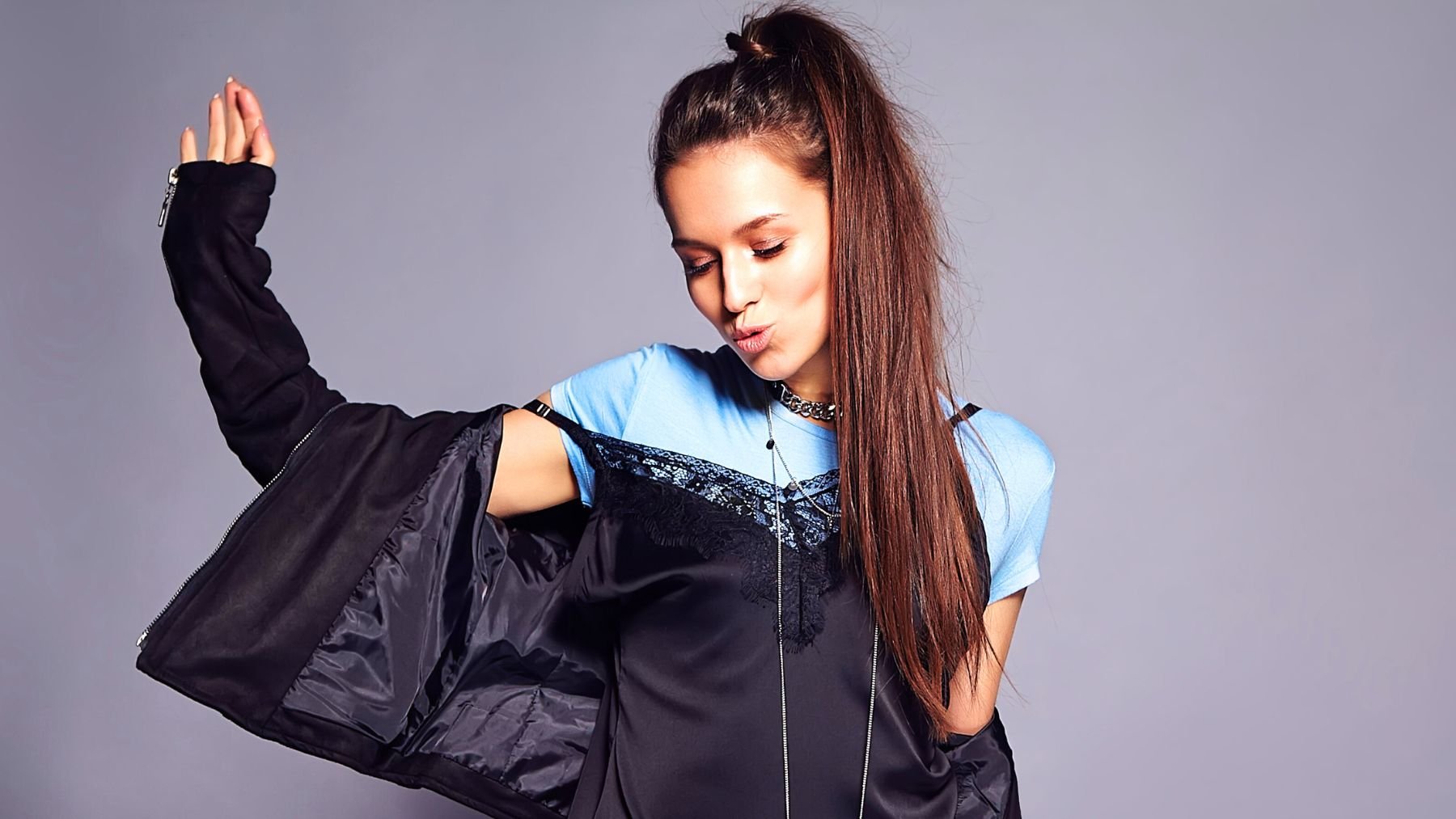
Some colors clash so hard that even a great outfit can’t save them. One of the pairings at the top of the list is black and blue.
Here, we’ll look at why these colors clash, what versions of blue can actually work with black, and how to avoid the combinations that tend to flatten your entire outfit. We’ll also break down other color pairings that look mismatched, muddy, or simply distracting.
Why black and blue clash
Black is a strong, saturated neutral that demands clear contrast. When you pair it with navy or deep midnight blue, the colors sit too close together, making the outfit look like it missed the mark. Instead of forming a clean contrast or a cohesive monochrome, the two shades blur into each other.
That “almost the same but not quite” effect is what makes the combination feel off. In low light, the difference becomes even harder to read, which gives the outfit a dull, heavy finish.
But not all blues clash with black. Bright cobalt, icy blue, and rich turquoise hold their own next to black because they bring the contrast black needs to look intentional. These lighter or more vibrant blues lift the outfit, while navy and inky blue pull it into a dead space where neither shade stands out.
If you love darker palettes, pairing black with charcoal gray or deep forest green usually creates a cleaner line. If you still want blue in the mix, swap navy for a medium-toned denim blue. Black jeans and a denim shirt or a black blazer with relaxed blue denim work because the difference is clear and readable.
Other color combinations that don’t work
Black and navy may be the most common clash, but several other pairings tend to fall flat. Some fight each other’s undertones; others collapse into muddiness. A few are simply too loud together to look polished.
- Brown and black: Both shades are heavy neutrals, but together they feel blocked and dull. Each one needs a lighter shade nearby to gain definition. Without it, the outfit looks weighed down.
- Gray and brown: Gray has a cool undertone, while most browns lean warm. When paired, they cancel each other out instead of complementing each other. The result looks muted in a way that doesn’t feel intentional.
- Red and green: Outside of holiday decor, these two look instantly seasonal. The contrast is strong but reads as theme-specific, which makes the outfit look more like a costume than a color choice.
- Purple and yellow: These are complementary on the color wheel, but in clothing they tend to create a high-saturation clash that’s hard to balance. It can look sporty or cartoonish unless one shade is very toned down.
- Red and orange: Both shades sit side by side on the spectrum, which makes them blur together without creating contrast. They create a loud monochrome effect that’s tricky to wear cleanly.
Some color pairings look sharp and intentional, while others look like an accident. Keeping contrast, undertones, and shade depth in mind makes it easier to spot combinations that work and avoid the ones that flatten the outfit. A thoughtful swap in color can make the entire look feel more coordinated.

