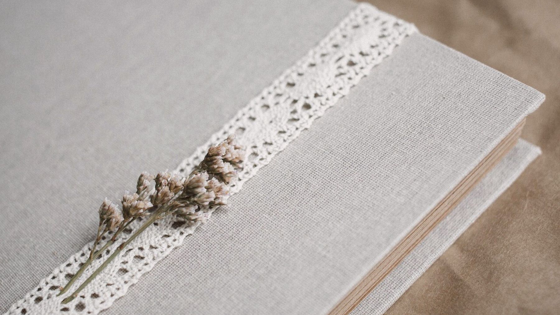
Beige might seem like a simple color, but its subtle charm goes beyond its neutral tones. Known for its timeless appeal, it has quietly made a significant impact in interior design, fashion, and branding. Its understated presence often sets the stage for brighter colors to shine. But beyond aesthetics, beige carries a deeper meaning in the world of psychology.
Color psychology reveals how beige influences emotions and behaviors. From promoting calmness to creating a sense of stability, this hue has a unique place in shaping our perceptions and experiences. Let’s explore what beige represents and why it remains such a versatile choice.
The psychology behind beige
Beige is often associated with calmness and simplicity. Its neutral and warm tones create a sense of comfort that makes it ideal for spaces where relaxation is necessary, like cozy living rooms, serene offices, or inviting cafes. Beige tends to evoke a feeling of ease and balance, helping people feel grounded and less stressed.
Unlike bold colors that grab attention, such as red and orange, beige has a quiet presence. This makes it a great backdrop for other elements, whether in design or everyday life. It provides a foundation that doesn’t overwhelm and feels reassuring.
However, its simplicity comes with a downside. Beige can sometimes feel boring or uninspiring if overused. Too much of it may lead to a lack of visual interest, leaving a space or design feeling flat. That’s why it’s essential to balance it with other colors, textures, or patterns.
From a psychological perspective, beige also symbolizes reliability and elegance. It’s often chosen by those who appreciate a clean and uncluttered environment, making it a go-to for workspaces where focus and productivity are priorities. Beige’s understated nature helps reduce distractions and keeps the mind at ease.
The versatility of beige
One of its greatest strengths is its adaptability. Its neutral quality allows it to blend seamlessly with almost any color palette. Whether paired with earthy tones for a natural vibe or bold hues for contrast, beige can transform a space or design without overpowering it.
In fashion, beige represents timeless sophistication. It’s a staple in wardrobes for its ability to work in both casual and formal settings. In fact, it’s considered a must in minimalistic fashion. Similarly, in interior design, beige’s warmth makes rooms feel inviting and cozy. It’s often used to create a neutral base that’s easy to personalize with colorful decor.
Even in branding, beige sends a clear message. Companies that use beige in their logos or packaging often aim to convey dependability, quality, and elegance. It’s a choice that resonates with consumers looking for simplicity and authenticity.
A timeless choice
Beige’s enduring appeal lies in its ability to adapt while maintaining its calming influence. It’s a color that bridges the gap between simplicity and sophistication, offering endless possibilities for creativity and self-expression.
Whether you’re decorating a home, curating a wardrobe, or designing a brand, beige can be the quiet hero that ties everything together. Used thoughtfully, it has the power to create spaces and experiences that feel both elegant and comforting. That’s the truth about beige; it’s a timeless color with a stabilizing presence.
