


Graphology, the study of handwriting as a window into personality, offers fascinating insights into the unique traits that make us who we are. Even subtle details, like the way you dot your “i”, can hold hidden clues. Among these, the choice to draw a circle instead of a simple dot is particularly intriguing.
Though it may seem like a small quirk, a circular “i-dot” could reveal layers of personality that go beyond the surface. Here, we’ll explore what this distinctive style might say about you and take a closer look at how different ways of writing the letter “i” can reflect individual characteristics. Let’s begin.
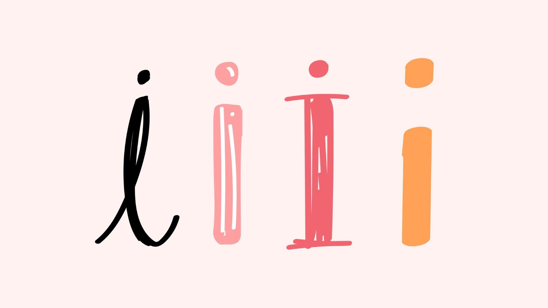
The meaning of writing a circular dot in the “i”
A circular dot over the “i” interrupts the natural rhythm of handwriting, breaking the flow that many writers instinctively follow. This small detail may hint at challenges with adaptability or even a subtle desire to stand out. Handwriting experts often associate this unique choice with a bid for attention, a touch of immaturity, or an effort to showcase originality.
In some cases, a circle dot may reflect self-centered tendencies or a quiet act of rebellion. When combined with other handwriting traits, such as weak t-bars or a leftward slant, it can suggest feelings of being out of sync with one’s environment. This inner tension may not be consciously recognized by the writer, but the choice of a circular dot subtly brings it to light.
A highly stylized or rigid circle, particularly one with a calligraphic touch, could point to obsessive attention to detail. This may signal traits like snobbishness, pedantry, or a strong desire to be noticed. Among younger individuals, the circular dot is often seen as a mix of self-expression and the quest for individuality, qualities that frequently emerge during phases of personal growth or transformation.
Other ways of writing the “i” and their meanings
The way you write the letter “i” can provide other interesting insights. Here are some common styles and what they might reveal:
- Precise, well-placed dot: This reflects a structured and focused mind. Writers who carefully dot their “i” are often seen as attentive, concrete, and exact in their thinking.
- Omitted or misplaced dot: Skipping or misplacing the dot may indicate carelessness or distraction. Writers with this tendency might struggle with focus or forgetfulness, occasionally overlooking important details in their lives.
- High-positioned dot: A dot placed high above the stem of the “i” reveals an idealistic and imaginative personality. People with this style are often dreamy and full of creative ideas, though they might occasionally lose touch with practical realities.
- Low-positioned dot: This suggests a practical and grounded individual. These writers are usually realistic, dependable, and focused on fulfilling their responsibilities with humility.
- Light pressure: A faint dot often reflects sensitivity, gentleness, or insecurity.
- Heavy pressure: A bold, firmly applied dot points to a strong and pragmatic personality. It can indicate materialism or a no-nonsense attitude, with a focus on achieving tangible results.
Each dotting style provides a small glimpse into personality traits, but none can define a person in isolation. Graphology emphasizes the importance of analyzing handwriting holistically. It’s the combination of multiple elements that helps paint a fuller picture of someone’s inner world.